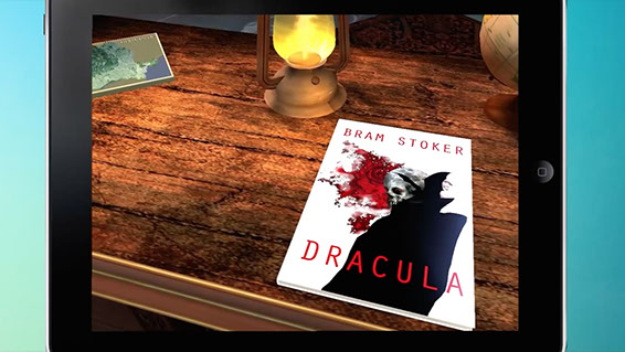
My adventures in hypermedia software design
At some point back in the early 1990s I was a 19 year-old Computer Science student, standing in the university computer room, staring at the table football-sized flatbed scanner beneath me, a yellowing copy of Robert Foster's 'Complete Guide to Middle-earth' stretched open in my hands.
Those were the days when we had to book the scanner in advance. In twenty minute slots. 'Why don't I wait twenty years until OCR software actually works?' I (genuinely) believe I said to myself.
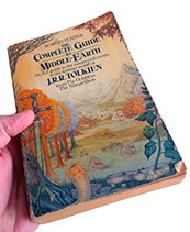 The itch I'd had, from my mid teens, had been to seamlessly connect the enormously detailed text of The Lord of the Rings with the even more enormous body of supporting materials written by Tolkien himself, his youngest son Christopher, and a cast of hundreds of academics and capable fans. I'd envisaged a means of marrying story and background content, allowing readers to delve beyond the narrative as and when they wished.
My motivation came from the reference source. Foster's painstaking work contained an alphabetical reference for most of the original terms in the book, including page numbers for a range of different editions.  This was some achievement in itself, but for the avid reader it would still mean keeping the tomes -- the novel and the reference -- open, with fingers and brain operating both. I wanted to collapse that to a single experience, enabling the reader (well, myself, as I had no idea whether anyone else would find it interesting) to quickly pull up the etymology of any term I wanted as I read.
But there was a big analogue stumbling block. This was long before Amazon or ePub. The Mosaic web browser had only just been released; the first widely-adopted window on what became the world wide web. The only copies of both The Lord of the Rings and Foster's Complete Guide that I had were the well-thumbed paperbacks in my bag. I had planned to use optical character recognition software to scan them in and convert to digital text, so that I could start my programming project. But scanners and OCR software were shadows of what they are today. Everything was glacially slow, and failure rates were frustratingly high. I ran tests and concluded that it would be more efficient to sit at the keyboard and retype the books word by word. And that was something I just didn't have time to do, between courses on concurrent logic programming and trips to the student bar.
So the project was, sadly, parked. My teenage dream dashed, I had to face-up to the fact that the technology just wasn't there.
Over fifteen years passed, during which I developed projects for the early web and for entertainment companies looking to develop and analyse their relationships with their consumers.
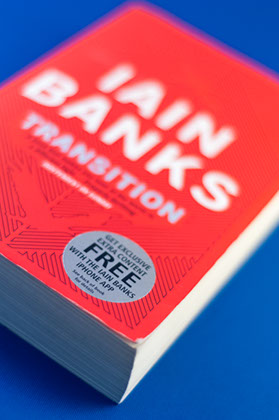 Then the opportunity arose to revisit the idea of layering a story on top of other elements. But not Tolkien, of course, given the rights-based reality of the publishing industry. As the creative technologist behind the New Zealand company Beyond The Story, I first experimented with creating apps which were official companion guides to physical books (for example with Iain Banks' Transition). In truth this was because of, again, the realities of the publishing industry and the attendant barriers -- at the time -- to accessing the author and the manuscript.
My first full-scale hypermedia product then came with the digital edition of Crown & Country, the history of the British monarchy by Dr David Starkey, the renowned historian and broadcaster. The app version is called Kings & Queens. With my historian wife as curator, together we crafted a multi-layered experience woven around Dr Starkey's text, featuring Dr Starkey himself as your personal tutor. Using only a small team, I doubled as concept designer, part-time programmer, and video director. It was a unique experience and was featured by Apple as the App of the Week when it was launched to coincide with Will and Kate's wedding in 2011. It is still promoted by Apple in the History and Education sections.
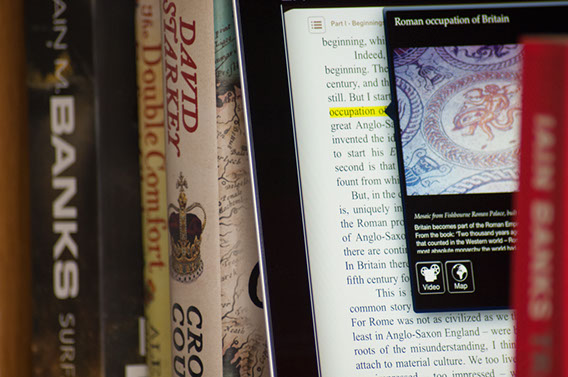
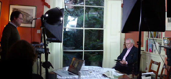
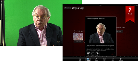
Around that time my colleagues and I had meetings with almost every publisher in the UK. I won't digress on the problems of inertia and attitude to risk in publishing; that is passim practically everywhere. But finally we captured the imagination of the forward-thinking digital head at Penguin with a hypermedia concept for one of the biggest-selling books of all time: The Diary of a Young Girl by Anne Frank.
By this point I had watched a number of technologies reach a good level of maturity. While at Universal Music, where I was developing an immersive social music service, I had been tracking the Unity game engine since it became publicly available. Although specifically touted as a 'triple-A' game framework, I felt that there was an opportunity to use it to augment traditional linear storytelling.
The key with Anne Frank was that I wanted to give readers the opportunity to experience Anne's world through the eyes of the author. The very atmosphere in which many of the diary entries were composed. So we brought in some talented Unity developers to help realise the vision. This meant bending Unity to our purpose, given Unity's support for typography was (and still is) near zero. We built our own print-grade typographic engine from the ground up.
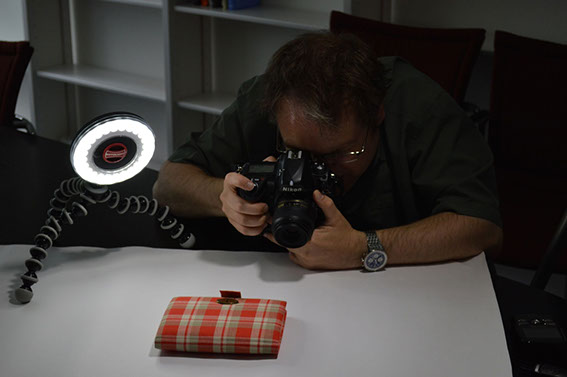
Immersion was key. I was given permission to photograph the Diary from all angles, and fed it through a technique called photogrammetry, which is a way to construct a 3D model from flat imagery. The texture and fibres of the red chequered cover and the worn edges of the paper were closely analysed.
Then there was the Secret Annexe, the area at the back of the canal-front warehouse where Anne and her family hid. The actual rooms in Amsterdam -- should you visit -- are kept bare by the charity which runs it. So we approached John Blair, the Oscar-winning creator of the Anne Frank documentary, for permission to reconstruct a three-dimensional model of the period layout of Anne's room that he created for his film. John shot in the Annexe itself, using special motion control cameras because of the cramped space, so all proportions and lighting were accurate. People sometimes comment that the arrangement and type of the furniture in the rooms is not known, because the Annexe was stripped after the occupants were arrested. However John Blair made his film with the co-operation of Miep Gies, one of Anne's father's employees, who risked the death penalty to keep their hiding place a secret, and who went inside the Annexe on many occasions with supplies and news of the War.
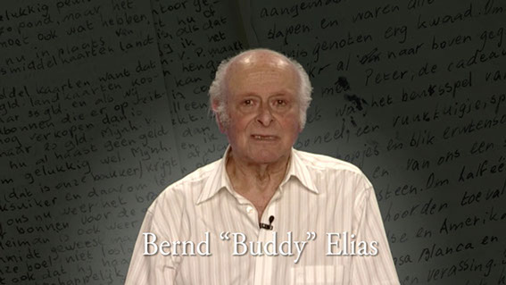
I also scripted and composited an introductory video, which was read by Bernd 'Buddy' Elias, Anne's last living relative. Buddy graciously gave his time in front of a green screen to read my words, which set the theme for young readers, asking them to realise that he was once a young person like them, and how as a young boy he knew someone as courageous as Anne. Click or tap the image below to view the introduction. The story and video were featured by The Guardian newspaper at the time.
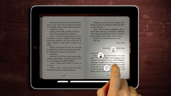
Meanwhile, our small team of holocaust historians developed the crucial supplementary materials for the app experience. Over twenty thousand additional words were written across many educational themes (including a comprehensive teachers' pack). The essential hypermedia experience is here. As you read, many key words can be touched. As you touch a word, the light dims and one or more icons swirl into view. These are choices for deeper content: textual context, archival imagery, survivor interviews, and 3D experiences. Click or tap on the following image for the official promotional video, which I produced from many elements with the Adobe Creative Suite.
I want to highlight the 3D aspects because they are so pivotal to the approach and why I wanted to do it this way. Behind it all is a desire to enrich the context for modern young readers. Because of the Diary's fragility, most young readers will never get the chance to see it up close, let alone touch it or turn the pages. Equally, while the museum in Amsterdam receives a constant stream of visitors, I feel it can be difficult for readers to make the connection between the words and the physical location when on site, partially due to the 'marching ants' effect of moving around the rooms when visiting.
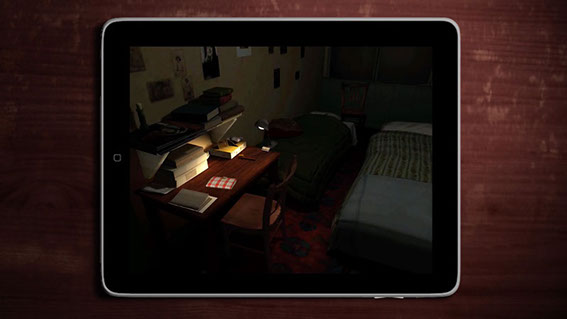
So I wanted to combine a few things: better understanding of physical context, understanding of historical context through visual reference, and an appreciation for the incredible artefact: the Diary itself, a small and unassuming autograph book, bought as a present for the film star-obsessed Anne, which happens to transmit down the years the voice of one young girl caught up within the greatest tragedy of the twentieth century.
The Diary itself is a mixed-media document, filled with photographs and inserts of all shapes and sizes. We selected a number of these pages and simulated them for the reader to experience. Even if readers are lucky enough to see the Diary on display behind a climate-controlled glass case, it's certain that they would never get close enough to experience the physicality of the pages and strips of paper and card Anne glued and taped inside.
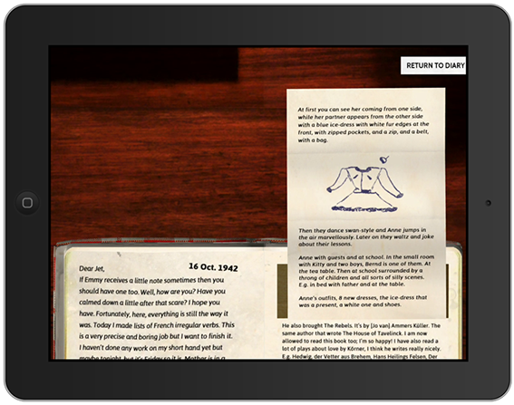
The Diary app has been listed as one of Apple's all time favourites on the store, and I'm honoured to have been able to work with Penguin and the Anne Frank Foundation in Switzerland. It has yet to be launched in the US but I understand this is due soon in 2014. One observation for anyone developing hypermedia concepts for older works: historical fragmentation of publisher rights globally can certainly prove to be an interesting factor!
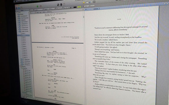
Since the Diary app was launched we have focused on modern entertainment properties, trying to engage viewers with deeper story. Last Summer, this involved me writing the hundred and fifty-thousand word novelisation of the third series of the award-winning New Zealand TV show, The Almighty Johnsons (available on Syfy and Netflix where not broadcast). This novel, planned and written using Scrivener, and released as the core of the official app of the show, was interwoven with each episode and a rich layer of extra episodic content. Viewers downloaded each 'chaptisode' (sorry) shortly after transmission, meaning their experience of show was extended beyond the main screen.
Now at Beyond The Story we’re preparing to launch Publisher+, which is the culmination of a great deal of this hypermedia journey. This web-based application will enable authors to transition their own works into the wider world of hypermedia storytelling. Much like we achieved with the Diary app, writers will be able to bring extra dimensions to their stories, taking readers off on unexpected directions through and beyond the tale. For readers and authors who only want the words themselves, that’s fine, and they don’t need to see the expanded experience as a threat or a disturbance. But for those who have a bigger story to tell, and the readers who want to absorb that level of richness, that future is almost here. Click or tap on the image below to view the teaser video for Publisher+.
Museum exhibitions as dynamic storytelling experiences using the latest technology
The secret of many great storytellers lies in their ability to adapt delivery to their audiences, even as they speak. Storytelling is at its best when it is not a one-way monologue but rather an experience which is shaped by the teller and the listener together. Underpinning this is the notion of real-time mutual discovery.
Great museum exhibitions tell great stories. But for practical reasons they lack a dynamic edge, unable to see the faces and hear the thoughts of the people walking around them. This is because many exhibitions are, to some extent, static place-holders for the mind and soul of the curator or curation team.
One of my passions is researching into how to use technology to bring a vibrant storytelling relationship to the fore. Recently, advances in certain areas of mobile technology have begun to show me that the potential is now there for the cultural heritage sector to take advantage of it.
Many modern devices (including more recent iPads and iPhones) ship with an enhanced Bluetooth technology known variously as Bluetooth Low Energy (BLE) or Bluetooth Smart. This technology has the potential to revolutionise the opportunities for bringing beneficial mobile experiences into the exhibition space.
Unlike with traditional Bluetooth, Smart devices do not need to go through a manual pairing procedure, which means they can talk to each other straight away without user intervention. This is hugely significant as an enabling feature for interaction.
You may have heard about 'iBeacons' or, more generally, simply beacons. These are Bluetooth Smart transmitters. Typically only a few inches tall, their primary function is to emit a unique signal within a specific radius, of usually between a few centimetres and a few metres. Software, loaded on to an iPad or other device with a Bluetooth Smart chip inside, can be developed to listen out for these beacons, and then triggered to perform a desired action when within range. A number of companies are already producing these beacons, including Estimote, Inc.
A basic use case for this is to replace the need for scanning QR codes as a means of location- and context-based interaction with an app. For example, a clothes store might place a number of beacons under certain rails or shelves, and then invite customers to download a companion app which is designed to provide them with more information about the items nearby. Such an app might show the different colours available, or similar items, or may even give the customer a special discount.
Customers still have the step of downloading the companion app but, after that, the app can listen out for -- and interact with -- any related beacons as they come into range, and automatically present the customer with relevant content.
The key thing is that the user does not need to do anything other than start the app and be within transmitting distance of the beacons. Therefore it is no surprise that retailers, as well as sports and entertainment venues, are already researching this technology.
But how about the cultural sector? Many museums have already experimented with mobile interaction through the use of printed codes, such as QR codes, which visitors must scan with their devices. Bluetooth Smart removes that cumbersome step: visitors need only be with proximity of a beacon in order for your app to provide them with the contextual information you wish to deliver. The technology has many different potential applications:
- Place a beacon in each room of the exhibition. Your app then triggers a screen of scene-setting background information for the room as the visitor enters. No need to have congestion points around wall-mounted text at the door.
- Place a beacon under selected objects or cases. As visitors walk up to the object, your app detects the beacon and provides commentary, video, or a three-dimensional representation of the object. No need for visitors to type in an object number to a traditional electronic guide.
These are the most obvious uses that some museums are already taking a look at. There are clear benefits to both the museum and the visitor. Convenience is a significant one, but a more subtle value is the potential for removing dwell hotspots around wall-mounted signage. Where space or foot-fall volume is a factor, this alone can improve the perceived experience for the visitor as well as safety and traffic flow for the museum.
Beyond the basic uses of these new Bluetooth Smart beacons, more exciting, integrated, and engaging opportunities exist. My own personal interest is in investigating ways to enhance the exhibition itself for both the consumer and the organisation.
Most beacon and app developments will centre around triggering individual beacons, because this is the lowest barrier to entry from a technical perspective. It's the easiest thing your app agency could do. However, multiple beacons can be used together to provide an 'indoor GPS' position for each visitor (but see the 'Challenges' section at the end of this article). Software can be developed -- such as the work I am currently undergoing -- to analyse the signal from three or more beacons -- when placed around the room appropriately -- and then calculate the approximate position of the visitor holding the device. Knowing the position of each visitor, in relation to the space around them, is an incredible step forward. The following diagram illustrates the potential:
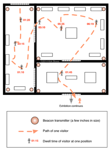
In the above, we see how one visitor, carrying a digital guide with on-board software which makes use of Bluetooth Smart, is tracked across the exhibition space. The visitor's position is triangulated (or, more correctly, trilaterated) by the relationship to the Smart beacons placed around the room. We know where the visitor is, the path he or she has taken and, importantly, how long was spent at various positions. And, of course, while I show only one visitor for clarity of illustration, your systems would in reality be tracking hundreds of visitors at the same time. Some of the possibilities, and the key focus of my own research and software development, include:
Visitor position tracking and longitudinal motion analysis (time-and-motion studies)
Developing an understanding of paths and dwell times around an exhibition is a critical part of the ongoing feedback loop. Traditionally this will be carried out by deploying staff to manually observe movement for periods at a time. This approach will only ever capture a minute percentage of the data possible compared to visitors carrying digital guides which are reporting location information throughout the visit. In this situation you now have a great deal of information about each visitor’s actual trail through the exhibition space, including the durations and locations at which that person came to a stop. For the first time you can have a startlingly detailed view of the way in which visitors move around your exhibition.
Route-based triggering and content adjustment
Using the same information, it is now possible to dynamically adapt the exhibition space to take in to account the behaviour of visitors. Software can be developed to understand the speed and direction of visitors, whether singularly or in groups.
At the basic end of the spectrum, electricity and projector lamps (which have a significant per-hour cost) can be saved by having such elements turned off until visitors are approaching. Noisy speaker effects can be toned down if no-one is within a specific range. Some of this may have in the past been implemented using passive infra-red sensors, but now there is the possibility to attenuate based on actual visitor movement, with much more fine-grained control.
A more sophisticated possibility is the notion of dynamic content adjustment. Exhibitions reveal information to visitors as they move around, view objects, and digest panels. In a multi-room and multi-theme space, there is often a desire to build additional insight into the interpretation by referring to other parts of the exhibition. However it is never guaranteed that the visitor has taken a specific route through the exhibition to enable the references to work. Naturally, if the visitor has been following a guided tour, the tour guide can make adjustments to his or her delivery to take the route in to account.
With a knowledge of the visitor’s route through the space, thanks to the handheld device reporting every few seconds, it is now possible to choose to display additional material based on what the visitor has already seen, and also signpost objects and themes that the visitor might wish to explore next. The result is a tailored experience for each visitor.
'Horde' sensing and reacting
Group visits play a large part in the daily life of museums. In many cases, particularly where the exhibition space has pronounced physical limitations, the group — especially one of an impromptu nature — is seen as a problem to be managed more than an opportunity to be taken. But the advances in technology I’ve outlined here could be woven into the design phase to make group management and support a valuable part of the exhibition. For example:
- Group engagement: suitable for either planned groups or ad hoc clusters of visitors. A ‘simple’ example would be an interactive space in which video-projected characters cajole visitors into choosing sides of a debate. As increasing numbers of visitors enter the space, their triangulated positions are constantly analysed, with perhaps the video characters’ eye-gaze moving and following visitors as they move around. Further screens give visitors feedback as they move to each side of the room, causing the scenario to land in favour of one or other side of the debate depending on how many have moved to either side. Rather than merely a gimmick, this could be woven into the exhibition’s core concepts, providing visitors with a rewarding ‘pay-off’ for following the themes and messages throughout their journey.
- Flow management / traffic diversions: some museums have a warren of interconnecting walkways and smaller spaces, through which the optimal number of people moving at once can vary significantly. Popular spaces can fill up without warning, leading to jams and tailbacks which have residual effects elsewhere. If visitors are carrying digital guides which are reporting location information back to the ‘central system’, it is possible to develop ‘pragmatic logic’ which can instantiate ‘diversions’ around the busy areas. This would be manifested as either electronic signs, literally diverting visitors, or as changes in the digital guide’s directions and suggestions, either of which you would expect the visitor to follow.
- Volume control: the technology can understand exactly how many people are stationary within a specific space, and alter the installation’s audio volume accordingly, acknowledging that large groups absorb sound and thus make coherence more challenging with merely a default volume setting. There may indeed be additional loud speakers around the space which can be temporarily added to the array to ensure those at the rear of the group also hear clearly. All of this could be achieved without staff intervention, and would revert to ‘normal’ once the group has moved on or has dispersed.
Challenges
Beacon technology presents a few gotchas in terms of exactly how it is deployed in any particular physical scenario. The transmitters are based on a part of the radio spectrum which is readily absorbed by humans, and is subject to fluctuating interference from walls, solid objects and bodies of water. These factors impact variably on the quality of the signal received by the mobile device. This sounds rather negative, but in reality a positive outcome can be achieved if each deployment is considered on its own merits, through a detailed analysis of the geometry of the exhibition space and the curation approach. Ideally the use of beacon technology should be a part of the layout planning process from the beginning, not only to devise an effective use of the technologies for the space, but perhaps more importantly to ensure a meaningful integration with the exhibition experience.
Conclusion
In this article I’ve tried to outline how recent advances in consumer-grade technology can be bent to the evolving needs of museum exhibition curation in the twenty-first century. Some of this was possible before, but was either dogged by cumbersome processes or was — perhaps begrudgingly — tagged on to an exhibition as an uncomfortable acceptance of technology. Visitor demographics, across the board, are walking into the museum today with astonishing familiarity with intelligent mobile devices, devices which are now capable of augmenting the visitor’s experience in an engaging and meaningful way. And as I liken great exhibitions to great storytelling, and with my passion for developing hypermedia storytelling concepts, I very much look forward to seeing how we can bring storytelling dynamism into the museum.
By Kirk Bowe. I'm a creative technologist and entrepreneur who is passionate about developing new technologies to bring great storytelling to digital devices. I can be contacted via the social links at the top of this page, or via [email protected].
New single 'Make it Right'
Excited to release a single (more info on this to come soon), streaming now on Spotify!
I can be contacted via the social links at the top of this page, or via [email protected].
As a software designer and creative technologist, I'm passionate about developing new technologies to bring great storytelling to digital devices. The views expressed on these pages are my own and not those of any employer or partner. I can be contacted via the social links at the top of this page, or via [email protected].
Copyright ©2014 by Kirk Bowe. All rights reserved.
